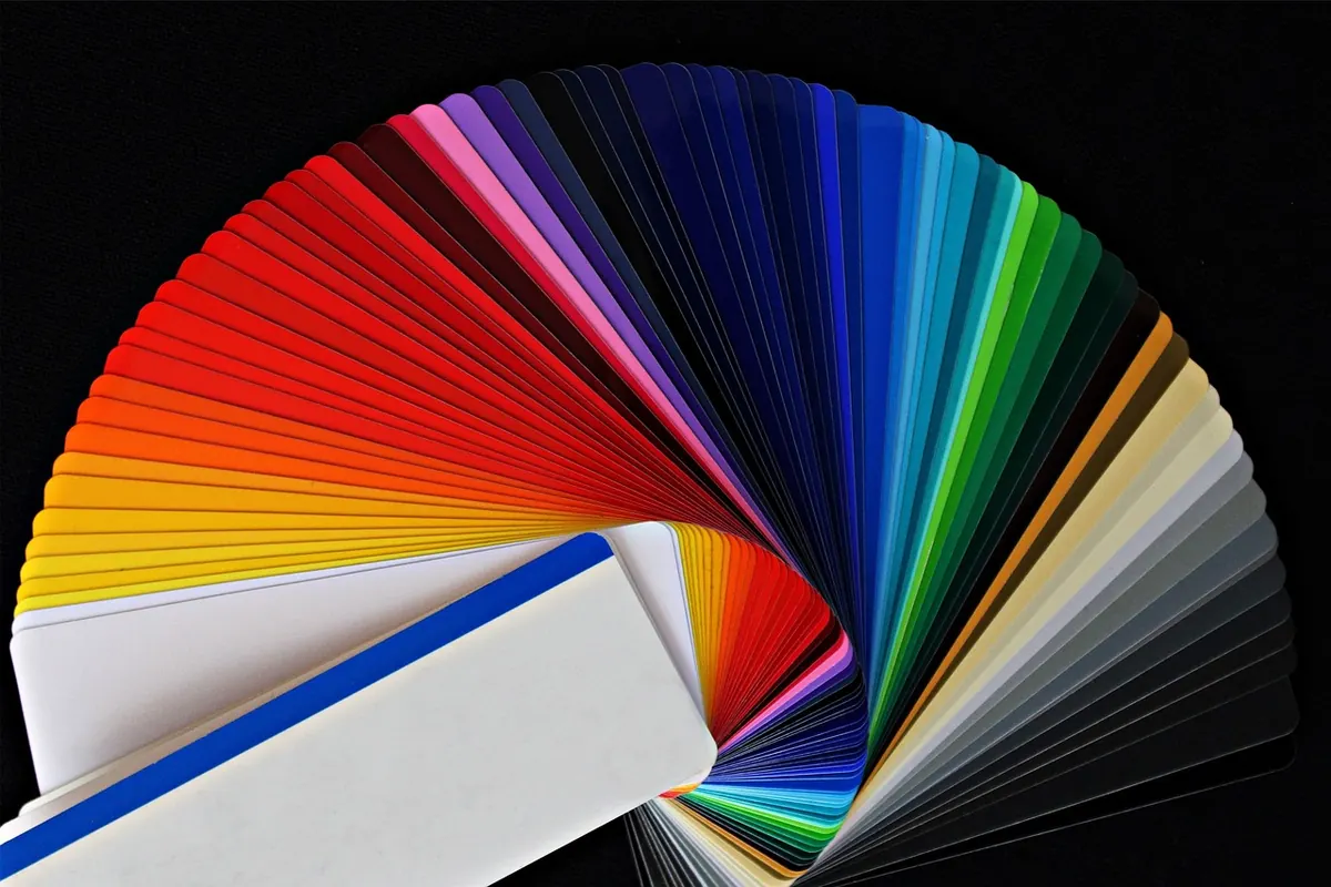
Choosing a Cohesive Colour Palette for Pattern Collections: A Beginner's Guide
Choosing colours for a pattern collection is not the same as choosing colours for a single design. One print can carry a bold clash or an odd accent; a collection needs a quieter kind of logic. The palette is that logic. Get it right and your motifs feel related even when they look different — a small floral on cotton, a geometric on paper, a larger repeat on wallpaper. Get it wrong and each design seems to belong to a different project. The method below is for beginners, but it is the same one many studios use: decide on a limited set of colours, give them roles, then test them on the surfaces they will live on.
Start with mood and references
Before you open a colour picker, write down three words that describe the collection. Calm coastal. Autumn orchard. Mid-century kitchen. Faded chintz. These words stop you from adding a colour just because it looks nice in isolation. Next, gather references: a paint chip, a piece of fabric, a postcard, a photo of a tiled floor. Do not copy them literally. Pull out the colours that repeat. If three different references all contain a soft grey-green, that is a signal. A palette that comes from several sources usually has more depth than one built from a single image.
Keep your references visible while you work. A physical pinboard is best; a folder of images on a second screen is fine. The aim is to keep asking one question: does this new colour belong to the same world as the others?
Build a core palette of five to seven colours
A collection does not need many colours. It needs the right ones, repeated with confidence. Five colours are often enough for six to ten patterns. Seven is generous. More than seven and you will struggle to keep each design distinct. Give every colour a job:
- Two neutrals: one light, one dark. Think chalk white and ink blue, or oatmeal and warm charcoal. These carry backgrounds, outlines and breathing space.
- Two mid-tones: the main colours that give the collection its character. Sage green and dusty rose, for example, or ochre and slate blue.
- One or two accents: small pops that draw the eye. Mustard, terracotta, coral or a clear red. Use them sparingly.
- Optional bridge: a colour that sits between two others, such as a muted teal that links green and blue.
Think in proportions as well as roles. Roughly 60 per cent of a design might be your lightest neutral, 30 per cent mid-tone, and 10 per cent accent. This is a guide, not a rule, but it helps you avoid a pattern that looks evenly speckled. A design with a clear base, a few larger shapes and a small accent will read better from a distance and repeat more cleanly.
Test the palette across fabric, paper and wallpaper
The same colour behaves differently on each surface. Fabric absorbs ink and softens edges; paper holds crisp, bright colour; wallpaper is often seen from across a room under changing light. If you design only on screen, you may be surprised later. Test early, even with rough samples.
Fabric
Print a small swatch or view your design on a textured background. Colours often appear darker and less saturated on cloth. If a mid-tone turns muddy, do not replace the hue. Adjust its value or saturation instead. Keep the hue family so the collection still reads as one.
Paper
Paper makes colour look sharper. Very pale tints can disappear, while bright accents can shout. Check that your lightest neutral still has enough presence against white paper, and that your accent does not overwhelm the mid-tones.
Wallpaper
Step back three metres from your design. Fine details and close values blur together. Increase the contrast between motif and background, and make sure the palette still works when the pattern repeats across a large wall. If a colour only works close up, it is probably not right for wallpaper.
Use value first, colour second
Value is how light or dark a colour is. A collection with a consistent value structure feels cohesive even when the hues vary. Convert your palette to greyscale. If every colour sits in a narrow mid-grey range, your patterns will look flat and mushy. Aim for one very light, one very dark, and the rest in between.
Use the dark for outlines, stems and small details. Use the light for backgrounds or highlights. Mid-tones fill the main shapes. When you plan a new pattern, sketch it in greyscale first. If it reads clearly without colour, the palette has a better chance of working. If it does not, no amount of colour will fix the structure.
Make a palette board and stick to it
Create a single reference file or a physical board. Include swatches with names and codes, whether that is a hex value, a Pantone reference or a paint sample. When you start a new pattern, work only from those swatches. It is tempting to add “just one” extra green. Resist it. If you must add a colour, remove another. This keeps the collection finite and forces you to solve problems with contrast, scale and layout rather than more hues.
Set up your software with a custom swatch group. Hide the default colour picker if it distracts you. A limited palette is not a restriction on creativity; it is a boundary that makes decisions faster. You will spend less time wondering whether a colour is right and more time drawing.
Common pitfalls to avoid
- Too many accents. If every colour is a highlight, none of them is. Let one or two accents do the work.
- Ignoring the substrate. A colour that sings on paper may fail on wallpaper. Test on the real material or a close equivalent.
- Matching every motif exactly. Variation in scale, rotation and layout is fine. The palette is what joins the collection together.
- Pure black and pure white. They can look harsh, especially on fabric. Try a soft black, deep navy or off-white instead.
- Testing a single motif. Always check a full repeat. Colours that look balanced in one flower may crowd each other when tiled.
A simple exercise to lock it in
Choose five colours. Assign each one a role: light neutral, dark neutral, two mid-tones, one accent. Print a test sheet on paper, view it on a fabric-like texture, and tape a swatch to the wall. Live with it for a day. If it still feels right, you have your collection palette. If not, change one value rather than replacing the whole set. Consistency comes from repetition and restraint, not from more colours. Once the palette is set, every new pattern becomes a variation on a theme — and that is what makes a collection feel intentional.
Photo: avantrend / Pixabay

How to Carve Rubber Stamps for Repeating Motifs on Fabric
Carve a simple rubber stamp, load it with fabric ink and print evenly spaced repeats onto cotton or linen...

Motif vs Pattern: What's the Difference in Surface Design?
A motif is a single self-contained shape; a pattern is what you get when repeats, layout, scale and colour...
About Us